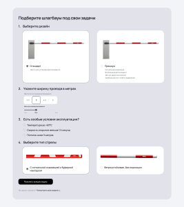
Example of a Responsive Form with Graphical Controls:
Check out this live working example:
👉 example

Graphic form full
This page demonstrates cross-browser responsive markup fully compatible with mobile phones, tablets, and desktops. The form is built using the following technologies:
- Bootstrap 5 — for the responsive grid, core components, and modal window;
- Vanilla JavaScript (no frameworks) — for handling user interactions and collecting data;
- Custom CSS styles — for a unique visual design.
What UI Elements Are Used in the Form?
Instead of standard, “boring” input fields, this form uses intuitive and visually clear UI components:
- Graphic card-style buttons — for selecting the barrier gate design and boom type. Users see a visual representation of each option, not just text.
- Button group with fixed values — for choosing the driveway width (1.5 m, 2 m, 2.5 m, etc.). This simplifies decision-making and prevents input errors.
- Range slider for size selection (<input type=”range”>)
- Modal window — appears after clicking the “Get a consultation” button and either displays the result or serves as an action confirmation.
Data Submission: Ready for Backend Integration
All data collection logic runs on the client side. When the form is submitted:
- JavaScript gathers values from all selected options;
- Constructs a valid JSON object;
- Prepares it for sending to the server via a fetch() call (Ajax request).
Currently, the actual server request is commented out—this is intentional for demonstration and debugging purposes. Instead, all collected data is logged to the browser console (console.log), allowing developers to verify the data structure before connecting a backend.

