A cascading filter component (“city → school → teacher → date”) built with pure JS, CSS, and HTML — no libraries or frameworks. Native <select> elements are replaced with a “button + listbox” pair, so the dropdown list is fully styleable.
Check out this live working example:
👉 example
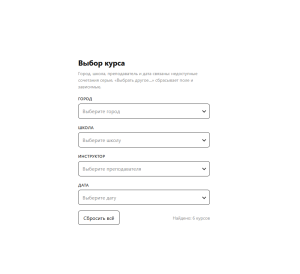
Custom Dependent Selects
Features
- Mutual field filtering: a selection in any select narrows the available values in all the others.
- Unavailable options don’t disappear: they stay in the list, grayed out and disabled — the full picture of choices remains visible, and the list doesn’t “jump”.
- A “Choose another…” item appears once a value is selected and resets the current field together with its dependents (everything below it in the chain).
- Auto-selection of a single option: if only one value remains under the current filters, it is selected automatically; after an explicit reset, it is not forced back on the user.
- Any number of fields and any dependency order — defined by a single
FIELDSconfig array, with no code copy-pasting. - Value formatting: the
valuestores the original string (e.g., an ISO date), while the user sees human-readable text. - Result line: a count of matching courses, or the ID of the single matching one.
- Accessibility: ARIA listbox pattern, full keyboard support (↑↓, Enter/Space, Esc), closing on outside click.
- Responsiveness: the form stretches up to 420px, the menu is height-limited and flips upward when there isn’t enough space at the bottom of the screen.
- Styling via CSS variables: borders, focus color, radii, and the palette are all changed in a single
:rootblock.
How It Works
- Single source of truth. Every action (click, keyboard, reset) only modifies the filter object, after which a single
render()is called — the UI always matches the state, so desynchronization is impossible. - A select doesn’t filter itself: the value list for a field is built from all active filters except its own; otherwise the select would “lock onto” its selected value.
- The full list of values for each field is computed once at startup and never rebuilt — only the availability status of the items changes.
- The dependency chain is defined by the field order in the config: resetting a field clears it and every field that follows.
- Incompatible selections are reset automatically: if a field’s value becomes impossible after a “parent” changes, it is cleared on its own.
- Data is a flat array of objects, easily replaced with a server response: after loading, it’s enough to recompute the value lists and call render.
The component fits any catalog or booking form where choosing one parameter constrains the others, and is integrated by copying a single HTML file and swapping in your own data and config.